Working with Workflows
Workflows in Primo RPA are designed for visual business process modeling. They are recommended when you need to:
- Clearly display complex workflow logic
- Implement branching and alternative scenarios
- Handle exceptions and execution errors
New Features (version 1.25.3+)
Try-Catch element for error handling
This functionality allows you to:
- Create separate branches for handling exceptions
- Control duplicate transitions (the system issues warnings)
- Note: when creating duplicate transitions, the system automatically detects conflicts and issues an error.
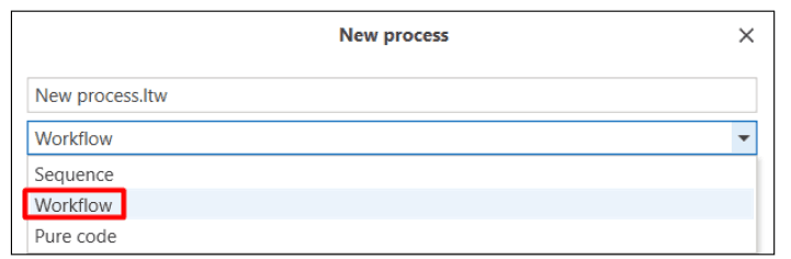
You can create a workflow in two ways:
-
Select the Workflow type when creating a process:
-
Add a Workflow element to an existing sequence or to a workflow:
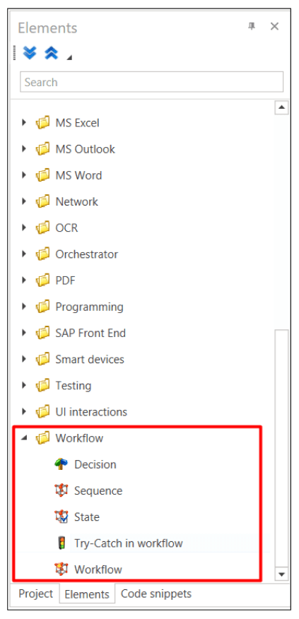
Workflow Structure
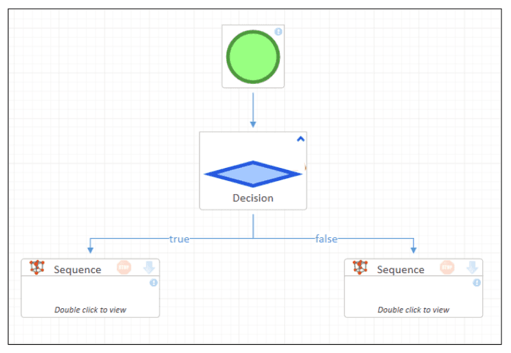
A required element of the diagram is the Workflow start element, represented by a green circle icon.

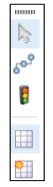
Additional elements available in the element panel in the Workflow group include the following elements:
- Decision;
- Sequence;
- State;
- Try-Catch in workflow;
- Workflow.
Their detailed description is provided below.
In addition to the listed components, any other elements can be transferred to the workflow. When transferred, they will be automatically wrapped in a Sequence element.
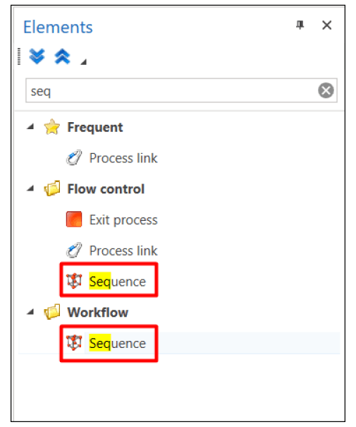
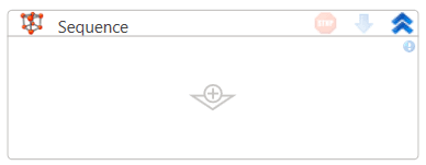
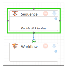
Sequence
The Sequence element is a rectangle enclosing a standard sequence. To add a sequence, drag it from the element panel:
To go to the stored sequence, double-click on the Sequence element:
To return to the diagram, click the Return button in the upper left corner of the diagram:

Decision
The Decision element is shown as a blue diamond and is used to branch the process flow, similar to the Switch construct in classic programming languages. To define a condition, specify an evaluated expression in the Condition field of the element’s properties panel.
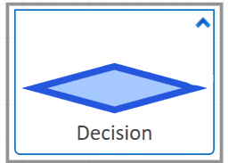
To add a decision, drag it from the element panel:
Workflow
The Workflow element
- A rectangle containing another workflow
- Allows you to create multi-level processes
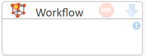
To add a workflow, drag it from the element panel:
 .
.
State
The State element is represented by a rectangle that contains the process states, between which transitions can be configured.
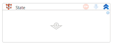
To add a state, drag it from the Elements panel:
 .
.
The State element operates as follows:
- Executes the Executable algorithm sequence.
- Runs the triggers of each transition.
- Checks the conditions.
- Proceeds with the first valid condition.
Working with the workflow
The workflow action panel is used to configure workflow:
To create connections between elements, you need to:
-
Click the Connection button
 on the workflow action panel.
 -
Next, hold down the mouse button on the green square on any edge of the element (if you need to specify the exact starting point of the arrow) or on the element itself (in this case, the element will be highlighted with a green border, and the arrow’s starting point will be set automatically). Then drag the arrow to the square of the target element—either to any of its edges or to the element as a whole.
-
To return to the normal cursor and continue working with other elements of the workflow, click the Pointer button
 on the diagram action panel.
Diagram connections can have three different shapes:
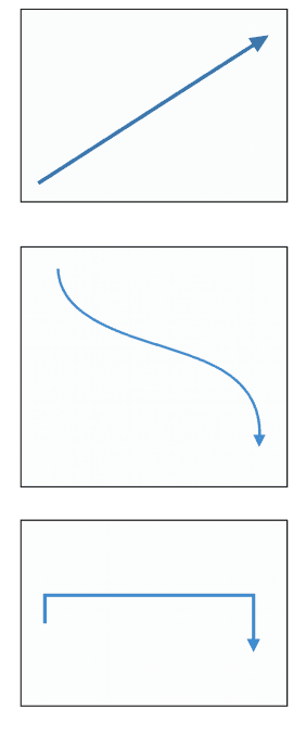
The selected type becomes standard for new connections.
Setting Conditions
For Decision elements:
To branch the process, you need to define the conditions to be checked. Select the arrow coming from the bottom square of the Decision element, and in the Check result property specify the value that matches the intended decision. An arrow without a specified result will act as the default decision.
Alignment Tools
To make it easier to align elements, the following functions are available:
-
Grid To turn the grid on or off, click the Grid button
 on the diagram action panel. When enabled, the main workspace is divided into squares to help align elements accurately.
 -
Snap to Grid To enable/disable snap to grid, click the Snap to Grid button
 on the diagram action panel. When enabled, elements move within the main workspace while snapping to the grid for precise alignment.
 -
Guide Lines Also, for convenience of alignment, guide lines are displayed when moving elements, along which you can arrange the element relative to others.
Otherwise, the workflow in its work fully corresponds to the sequence.
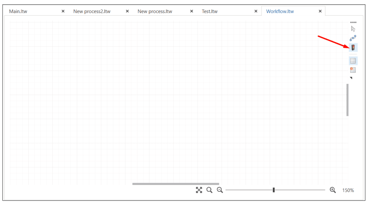
Debugging workflows
Starting with version 1.25.5, a new Skip step button  has been added to the Debugger panel.
It temporarily excludes the current element from execution without deleting it.